Explorations
Through a wide range of mediums, including various print-based works such as pictograms, record covers, websites, video, and hybrid formats, I explore how form, execution, and material choices shape meaning and accessibility.
These works function as both technical explorations and educational tools, using design decisions to clarify, challenge, and reframe information. Across each format, graphic design becomes more than a visual practice for me; it serves as a community-building tool that encourages critical reflection, fosters dialogue around dominant narratives, and supports the imagination of more inclusive, collective futures.
Projects
Business Cards and Pamphlet
Print - Canva
2023
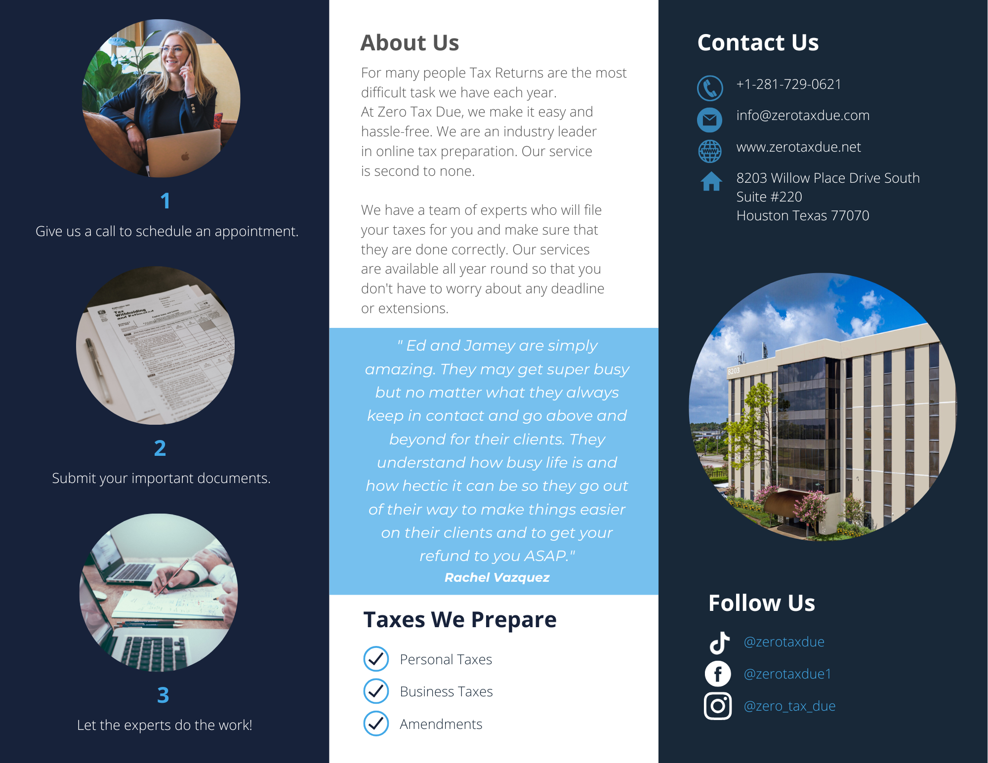
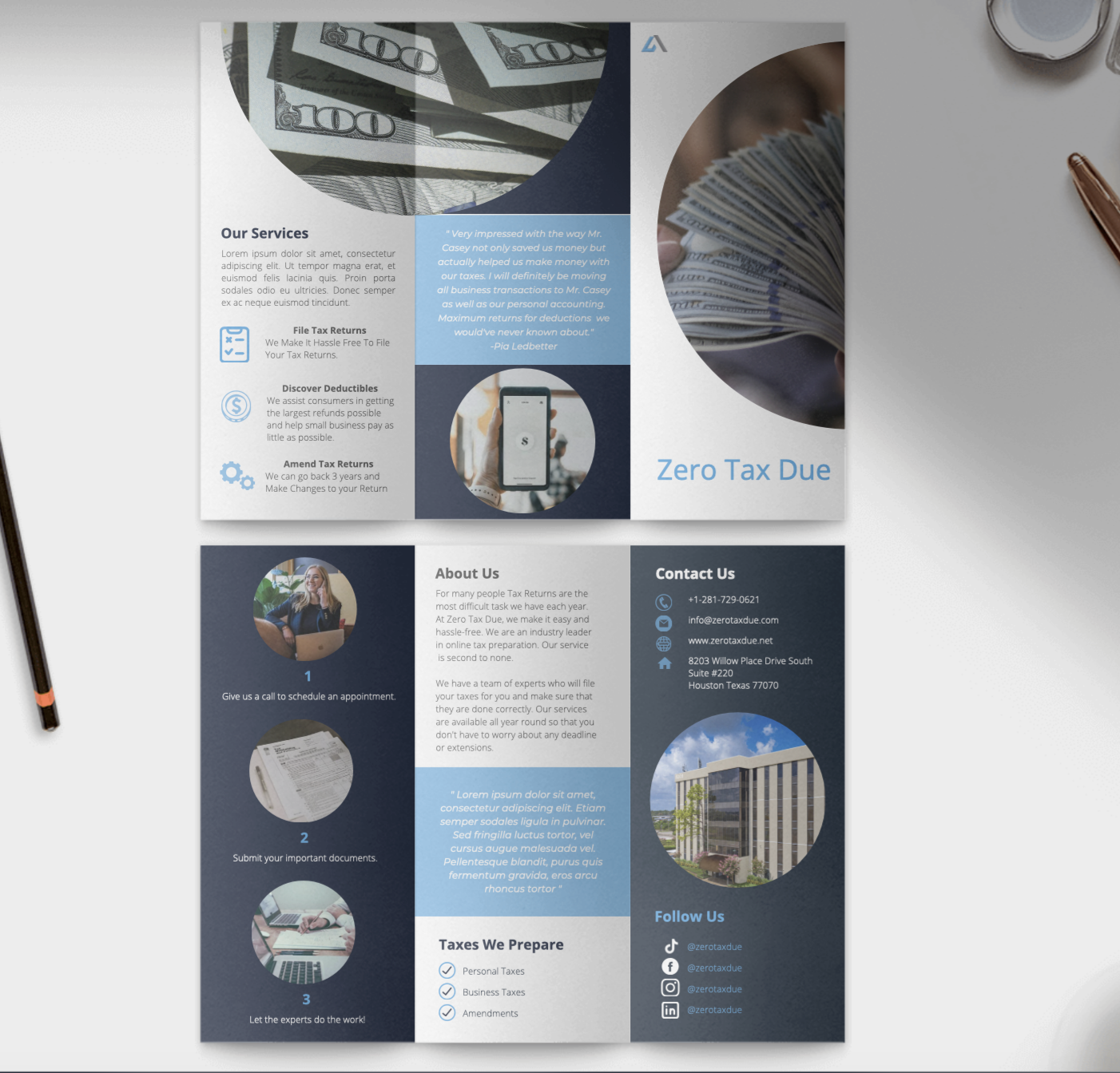
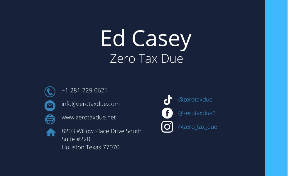
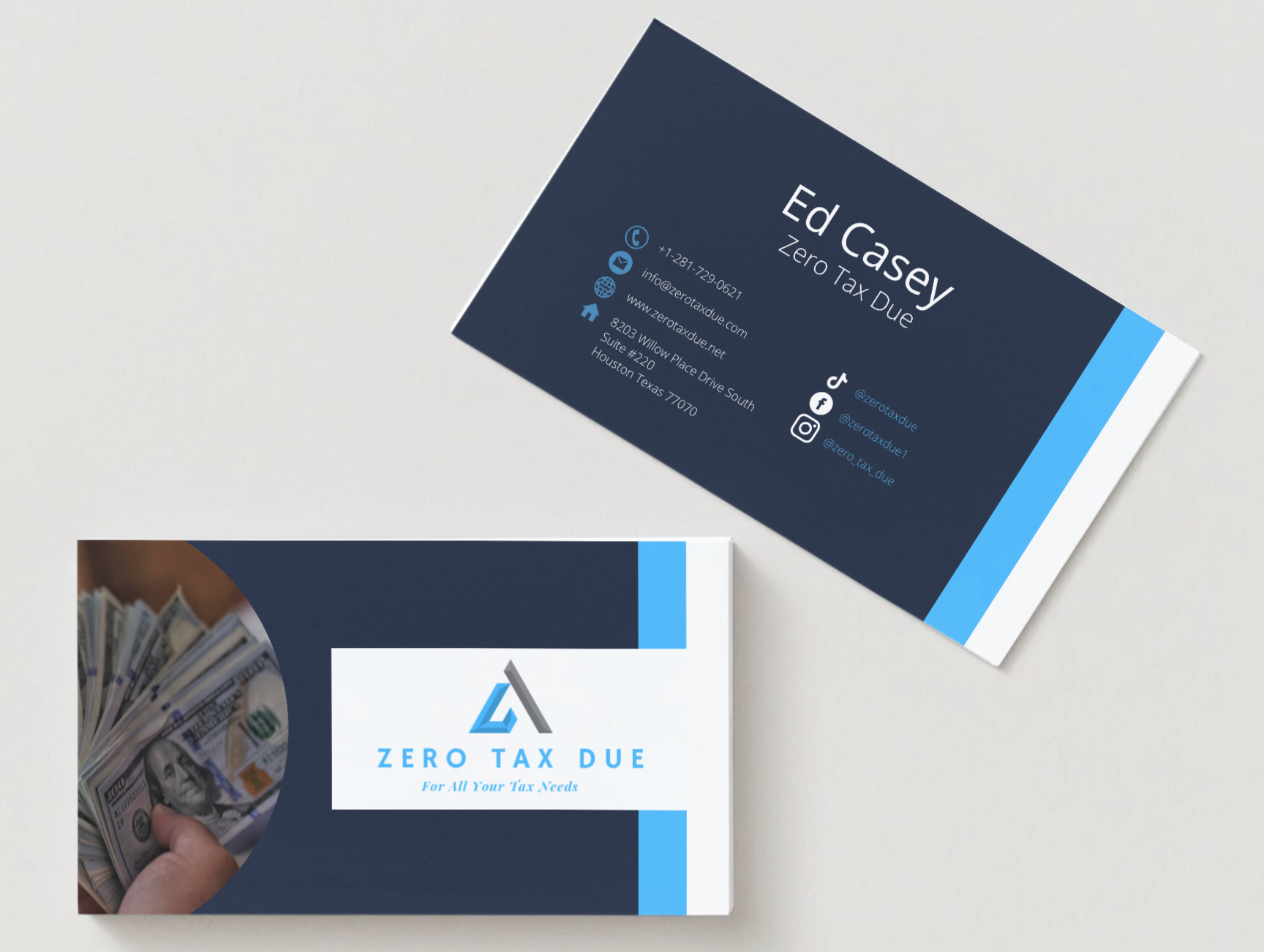
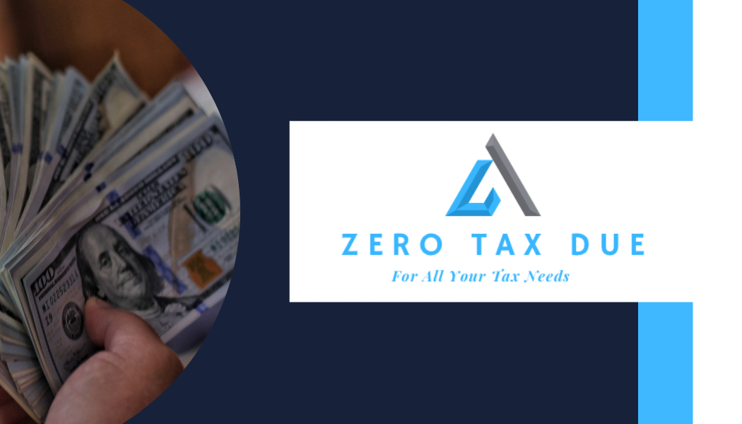
Taxes can be an incredibly daunting topic to approach. Most people turn to a tax expert to handle the process because they are unfamiliar with filing on their own and because no one wants to risk making a costly mistake. Zero Tax Due is a Houston, Texas–based tax company specializing in tax preparation services. The goal of this project was not only business promotion, but also making general tax information about where to go and how to get started accessible in a friendly, digestible way to ease the stress surrounding taxes.
Travel Videos
Videos - TikTok
2025
Interview
Video - Adobe Premiere Pro
Spring 2020
It starts after 5 seconds.
Lately, I have had the opportunity to travel a bit, whether returning to my hometown of Memphis or visiting the Dallas State Fair, and I have taken that time to try out my new DJI Osmo Action 5 on the go. Experimenting with typography, filters, angles, and movement while capturing memories for myself is always exciting. It allows me to explore new landscapes while pushing my design practice and testing new visual and technical approaches.
For this project, I interviewed five of my fellow classmates in the art department. My goal was not only to develop my skills in video execution, but also to learn about media releases and consent forms. I chose to focus on these young women because we shared the experience of being female and African American in UTC's art department. At the time, The University of Tennessee at Chattanooga, a predominantly white institution in the South, had around ten or fewer African American students in the department, with only four of us currently enrolled in the Bachelor of Fine Arts program. (And yes, this was 2019, not the 1960s.)
This context made the project especially meaningful. It was an opportunity to document and celebrate our perspectives while navigating the practical and ethical aspects of the department. Through these interviews, I explored both technical skills and the importance of representation, creating a project that reflected not only my growth as a designer and filmmaker, but also the stories and experiences of a community often underrepresented in the arts.
After showing the video to my class, my professor escalated the project to our Department Head. I still wonder what that conversation was like.
Looking back, this project also marked the beginning of my interest in User Experience and user research, as I found myself thinking about how to understand and improve the experience of the art department community through design and storytelling.
Album Covers
Print - Adobe Illustrator
Fall 2019
Pictograms
Print - Adobe Illustrator/Photoshop
Fall 2018
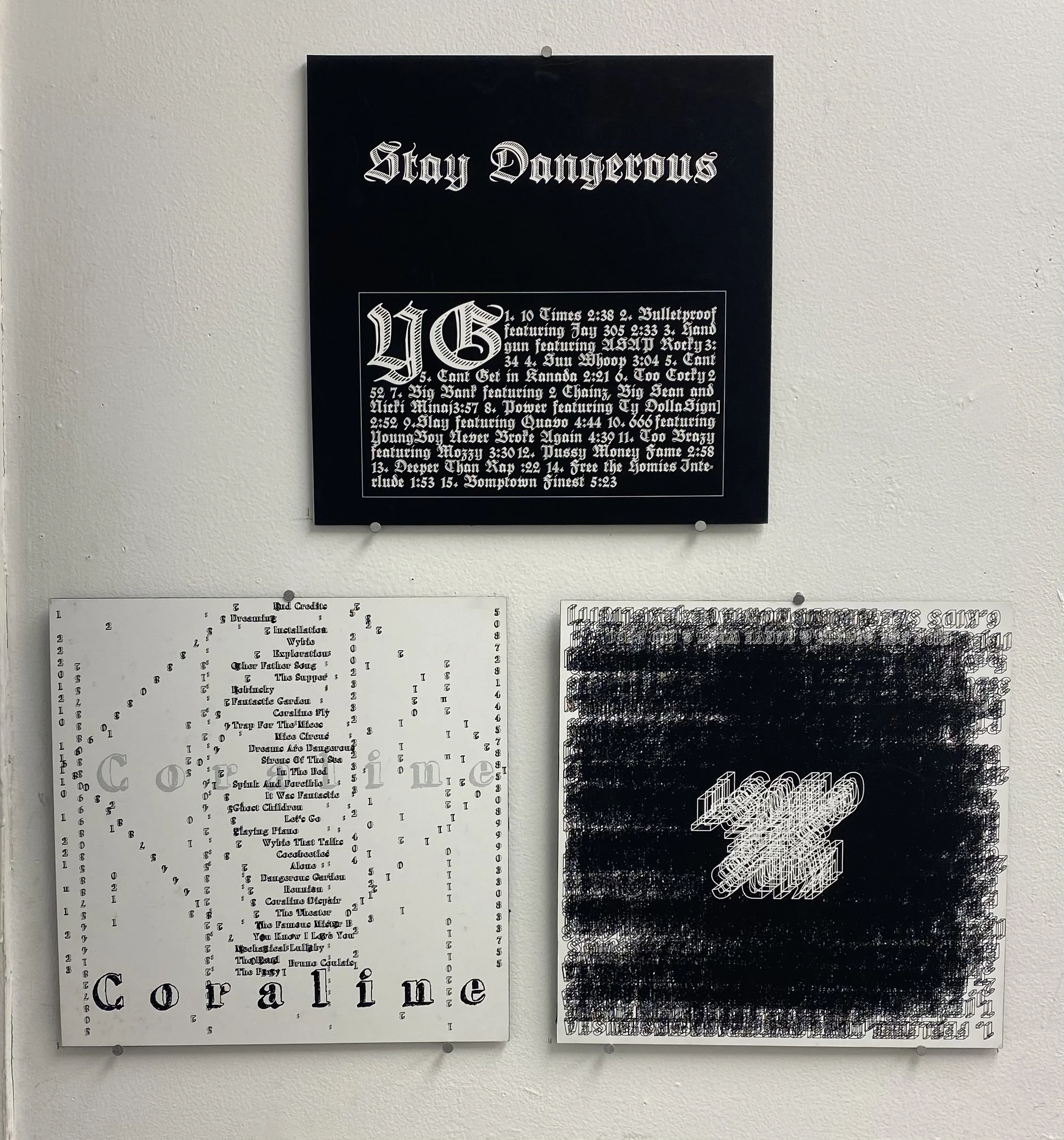
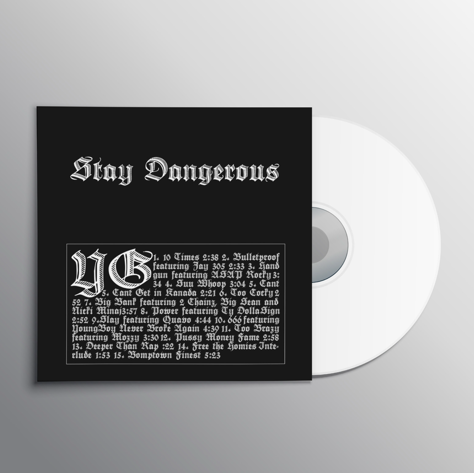
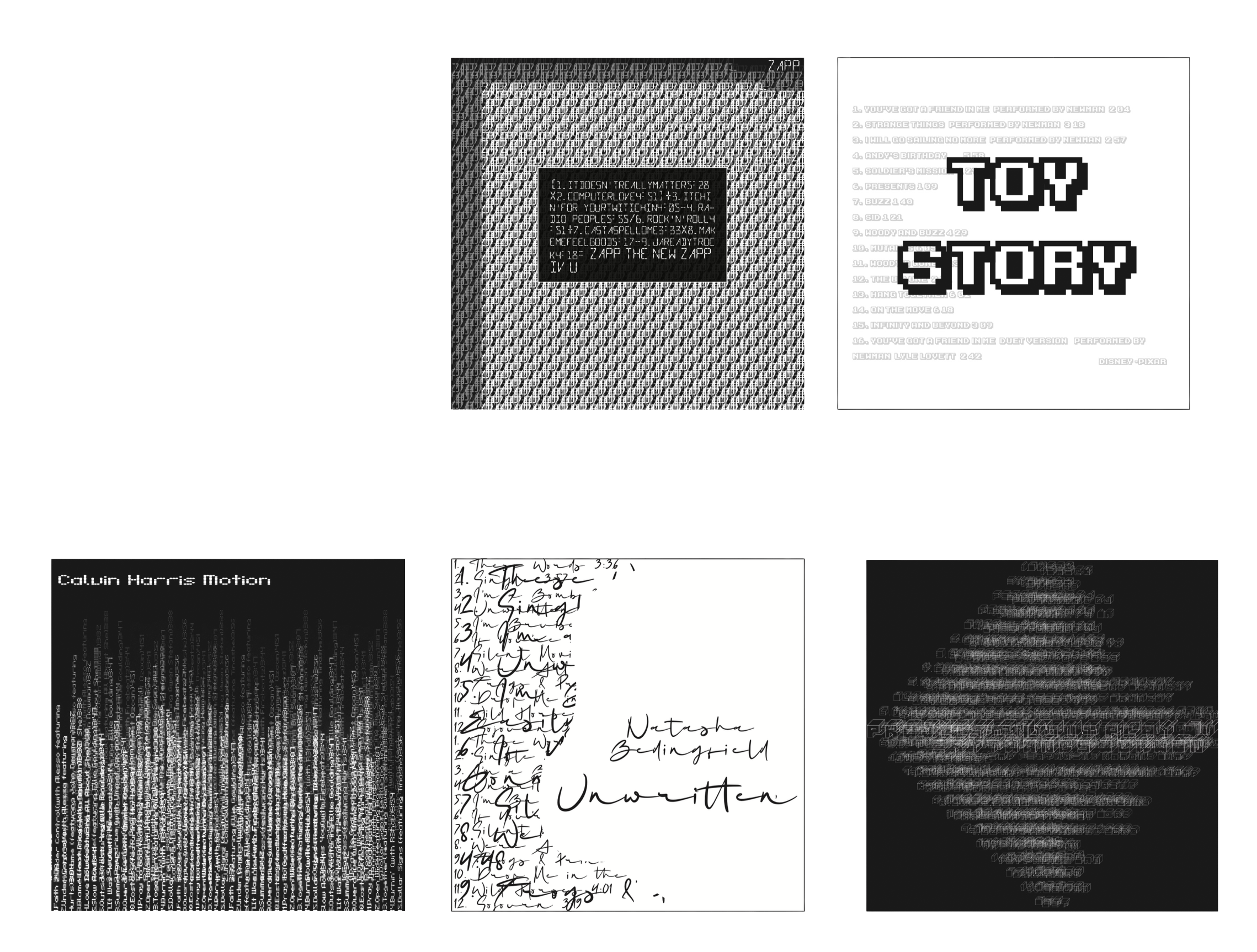
Over the course of 10 weeks, I practiced creating daily designs to challenge myself to be consistent in developing my creativity outside of my regular practice. The objects I created were album covers spanning a variety of musical genres and typefaces. I also worked within constraints, limiting myself to black and white and using only specific typefaces to amplify the information provided on the original album covers. Through these daily designs, I explored the many characteristics of different typefaces and pushed boundaries to create unique and dynamic covers.
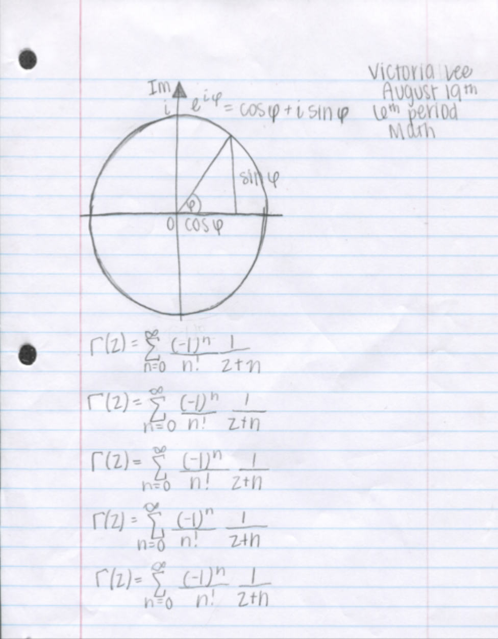
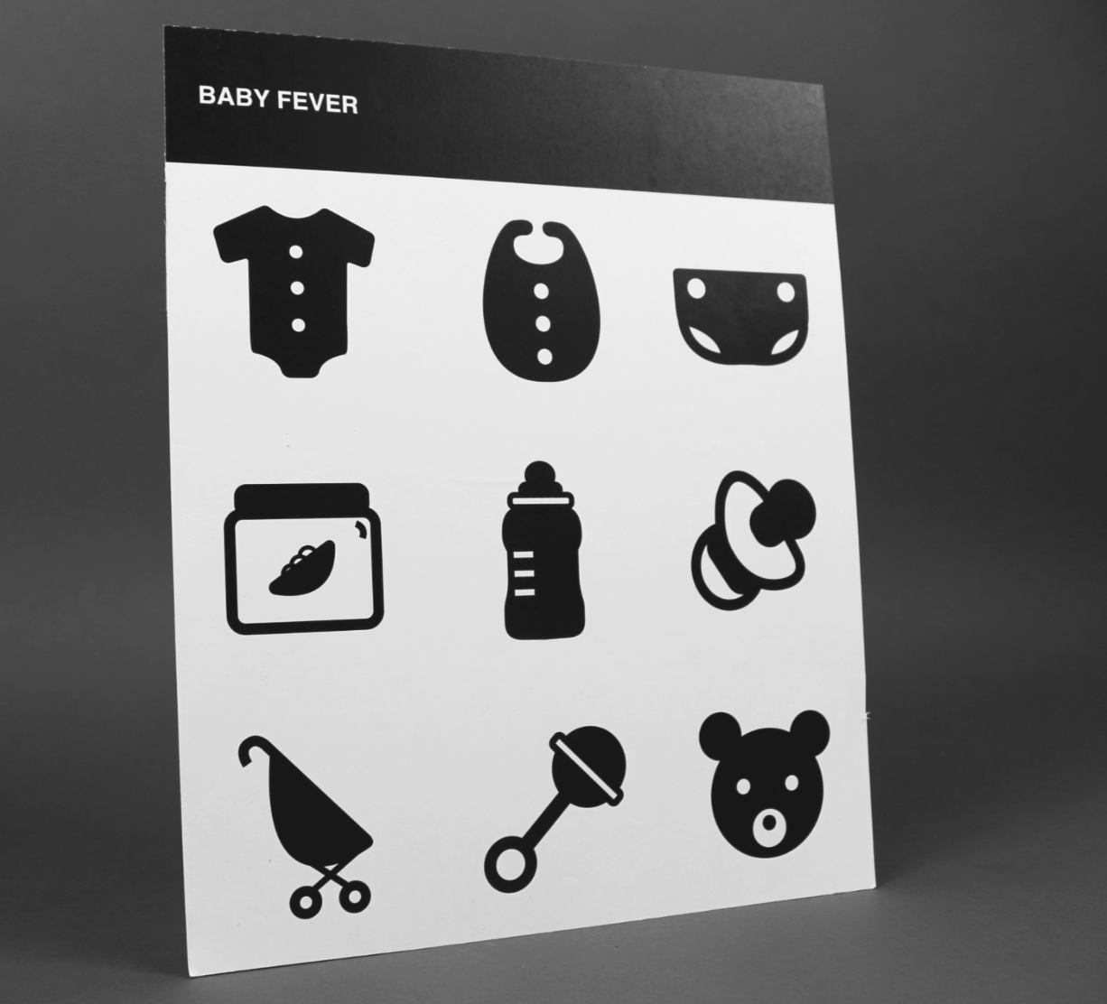
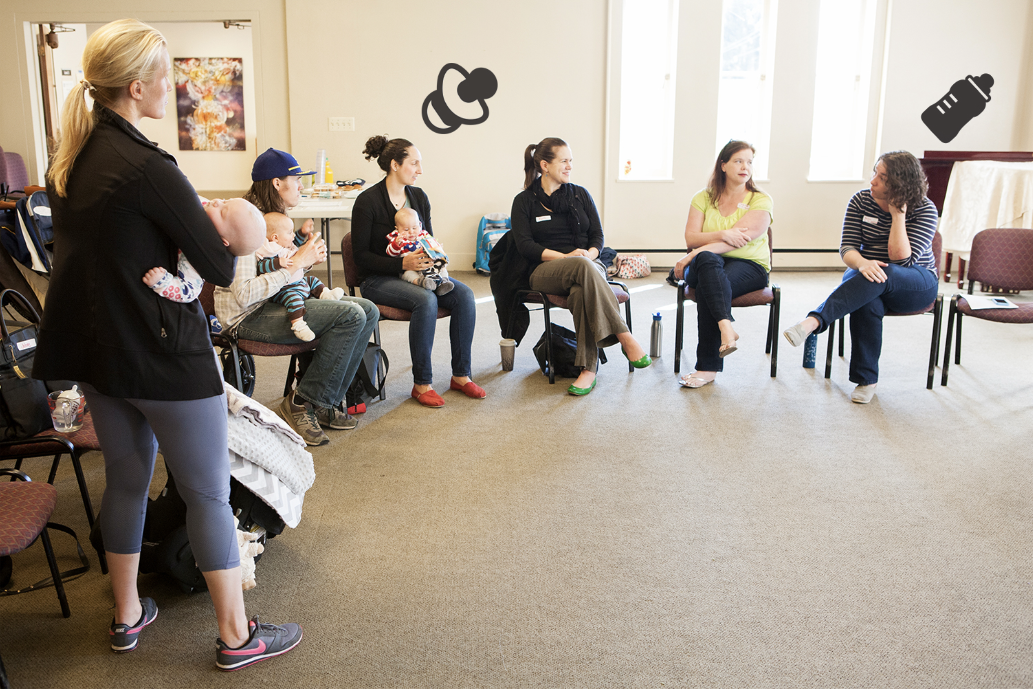
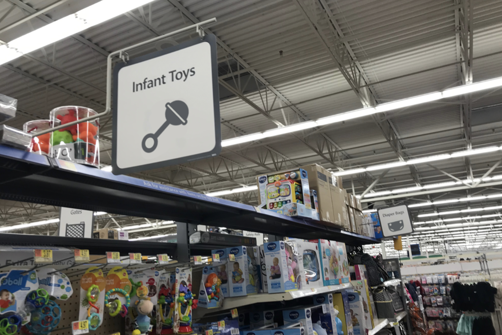
For this project, I created a series of pictograms, also known as iconography or icons. The pictograms were designed to be versatile, so they could be used for multiple purposes and occasions if needed. I chose babies as my main subject because they offered a wide variety of contexts in which they could be represented using a pictogram.
During development, I experimented with color, line weights, and different symbols, adding and removing elements as needed. For my final design, I focused on babies. Babies are something that will always exist, which allows the pictogram to be applied in many contexts related to infancy. Let’s be honest—baby stuff is so prevalent, I still eat Gerber puffs… don’t judge me, haha.
Overall, I was able to create a final piece that was cohesive and easy to associate with its intended meaning.
Soft & Hard Book Cover
Print - Adobe Illustrator
Fall 2018
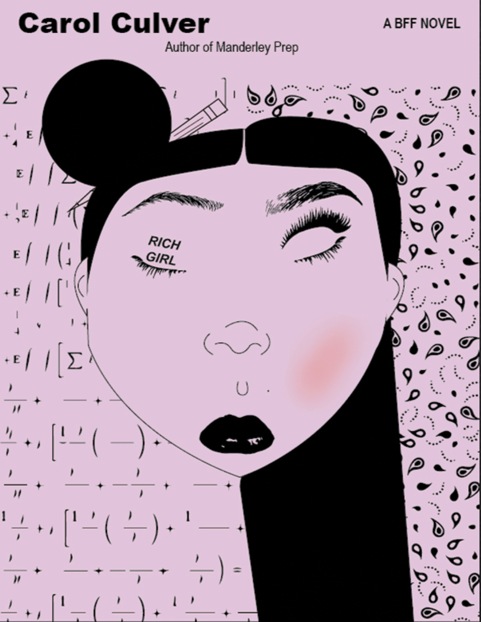
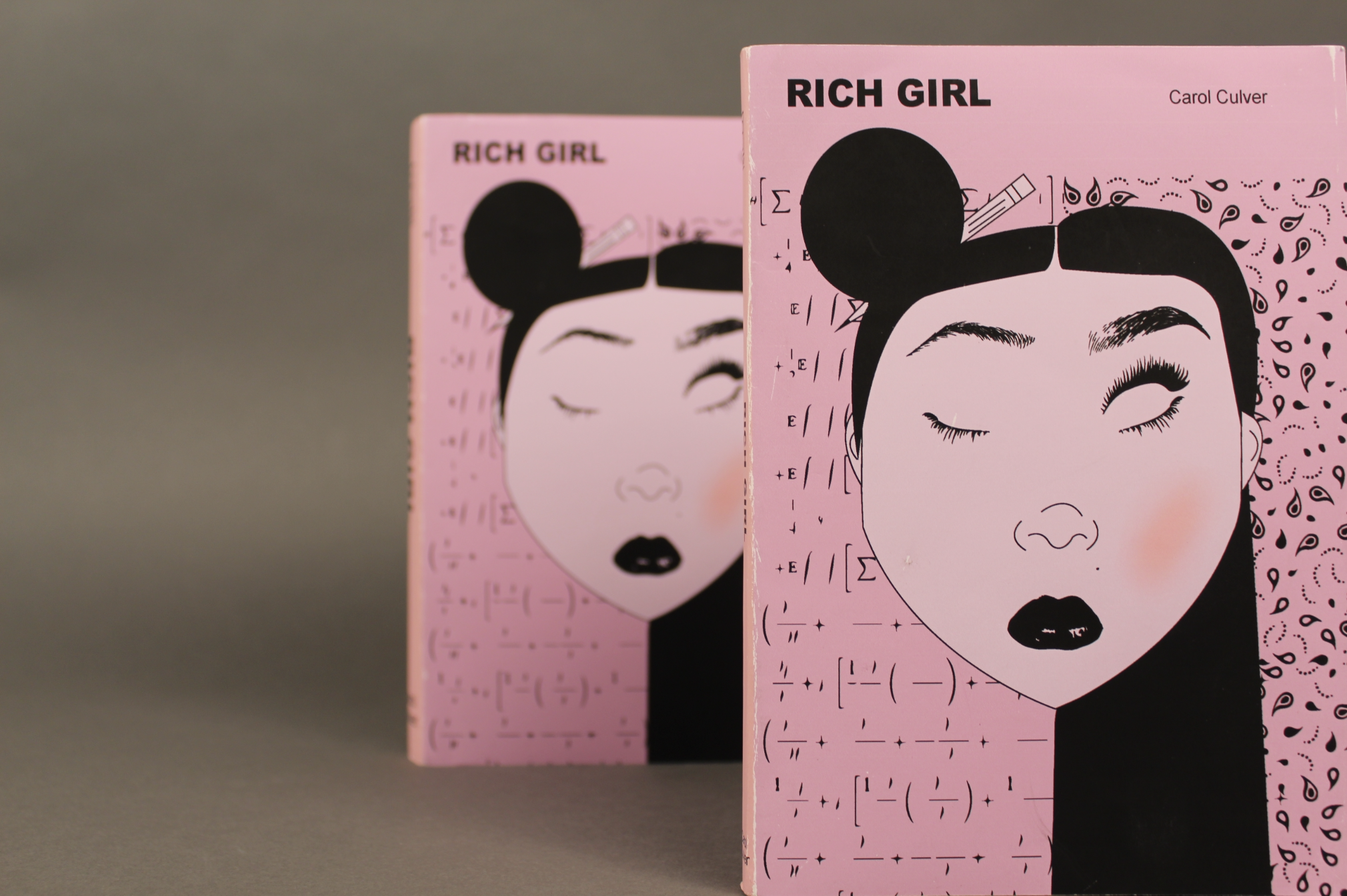
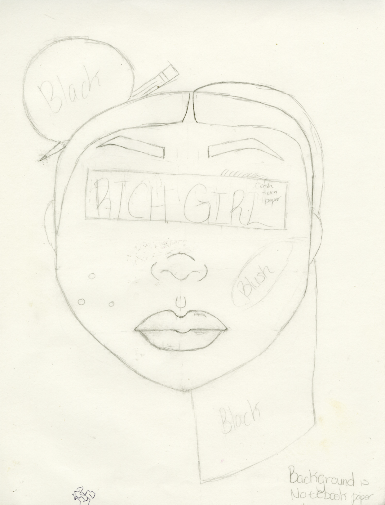
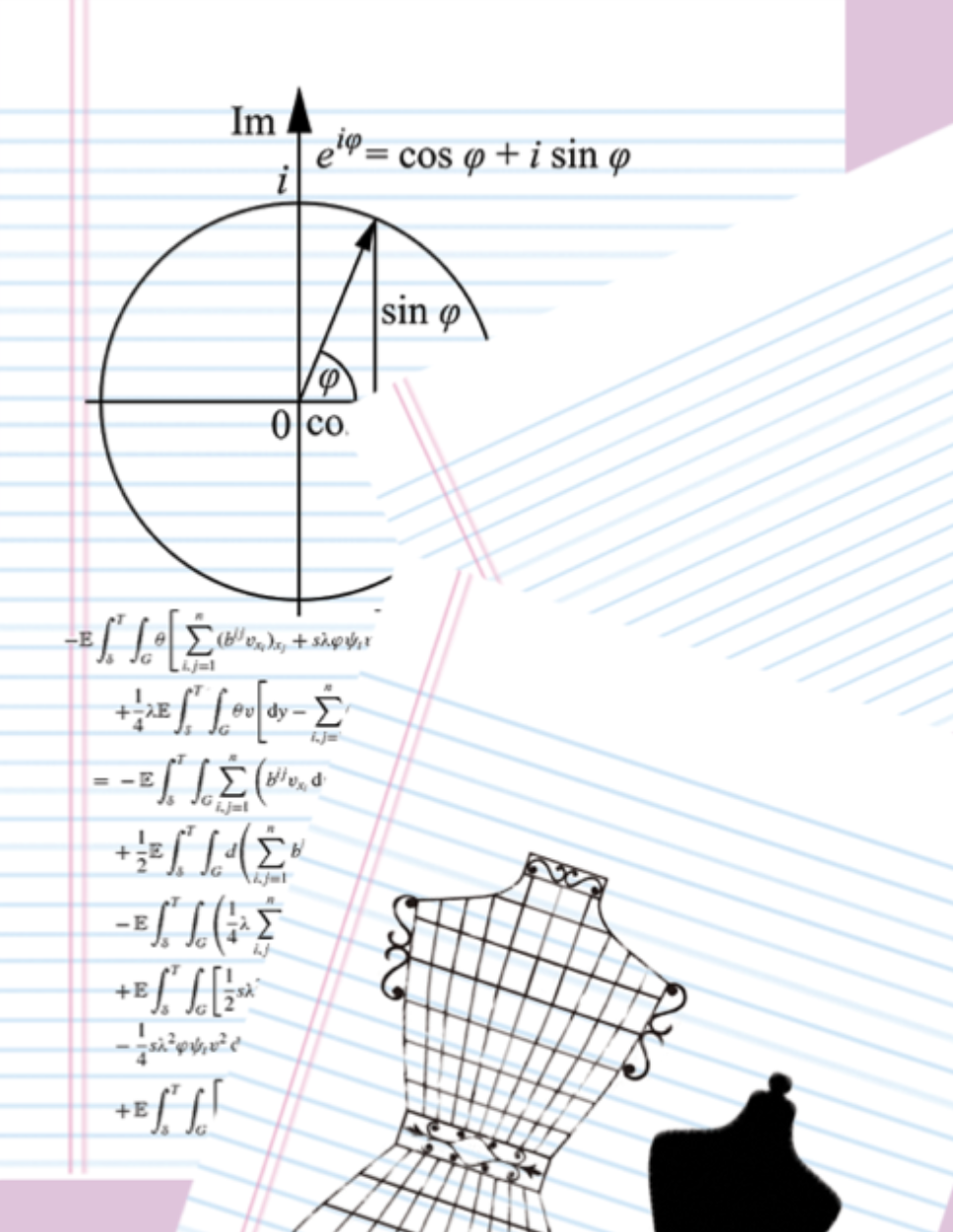
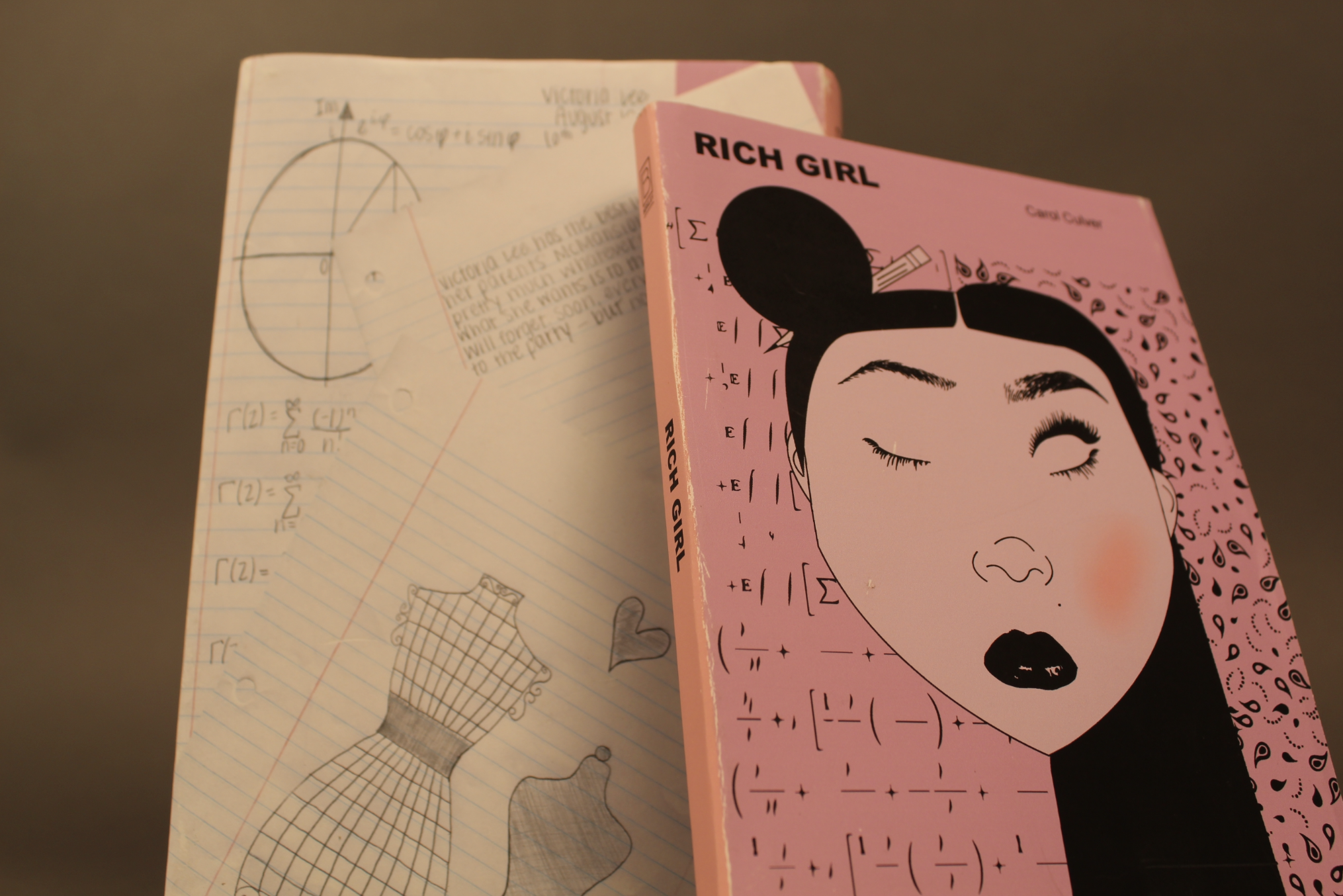
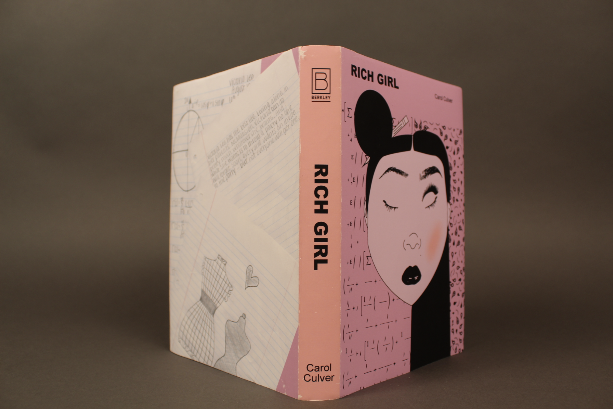
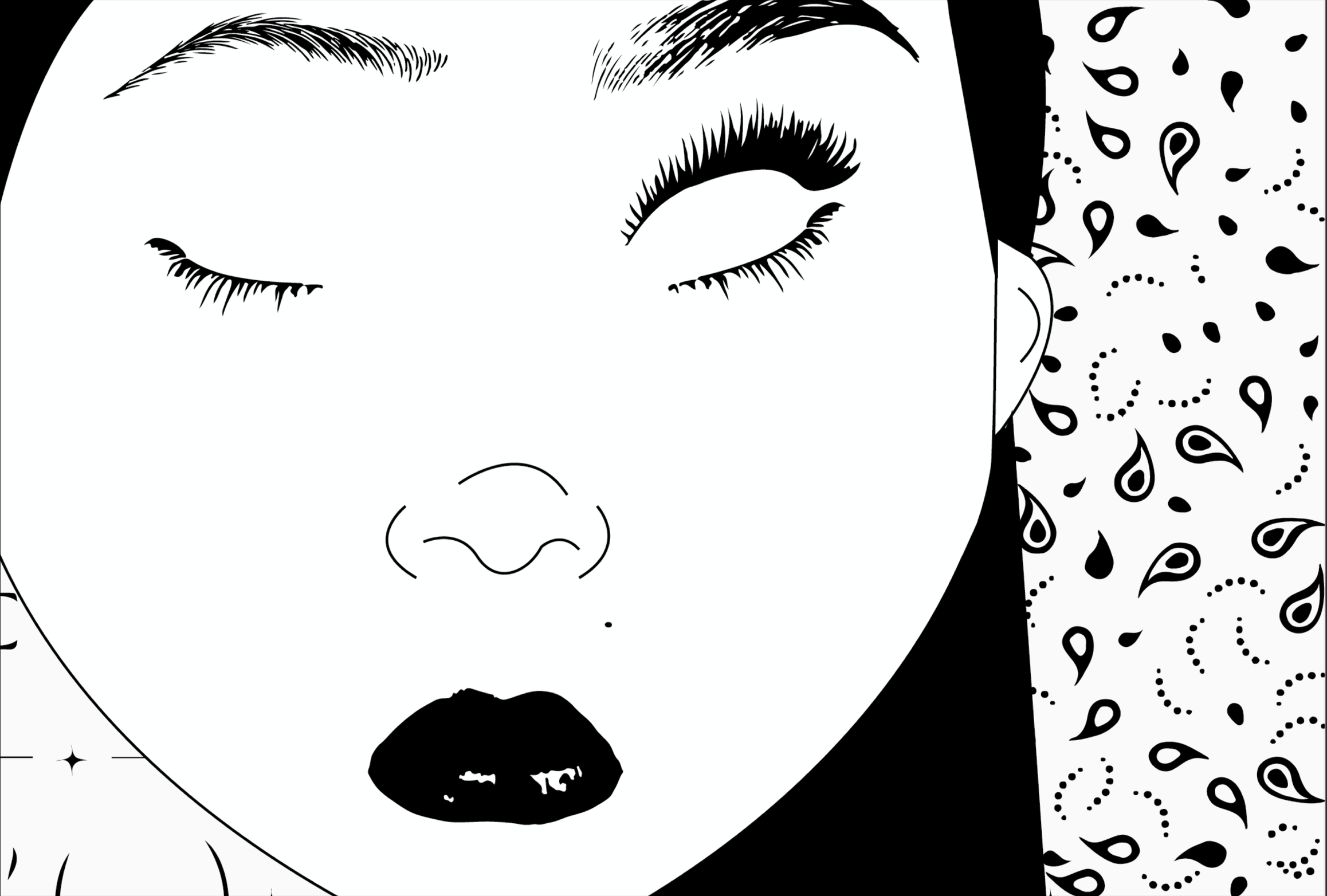
For this project, I designed two book covers for one of my favorite books, Rich Girl. I created both a hard and soft cover. I started with three book choices, but Rich Girl spoke to me the most, which is why I decided to focus on it. Using my knowledge of the book’s content and audience, I aimed to create a cover that felt glamorous while hinting at struggle.
My goal was to make a girly-girl cover that still felt sophisticated enough to appeal to tweens, teens, and young adults. By using variations of purples and pinks with bold moments of black, I was very satisfied with the overall look. I also incorporated handwritten notes to give the covers a more authentic and personal feel, helping readers form a connection. Overall, the final designs are chic, modern, and clean.
The Grid
Print - Adobe Illustrator/InDesign
Fall 2019
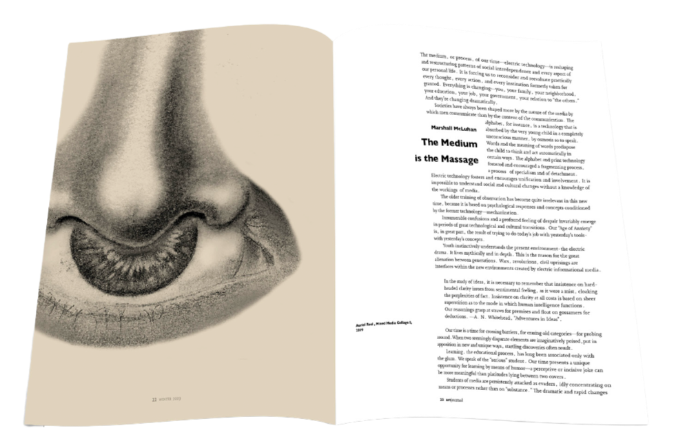
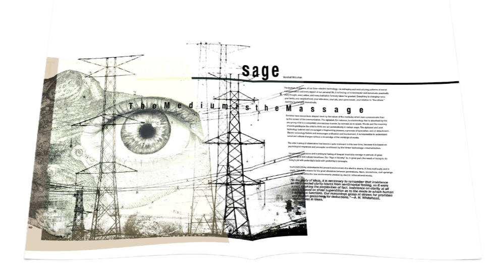
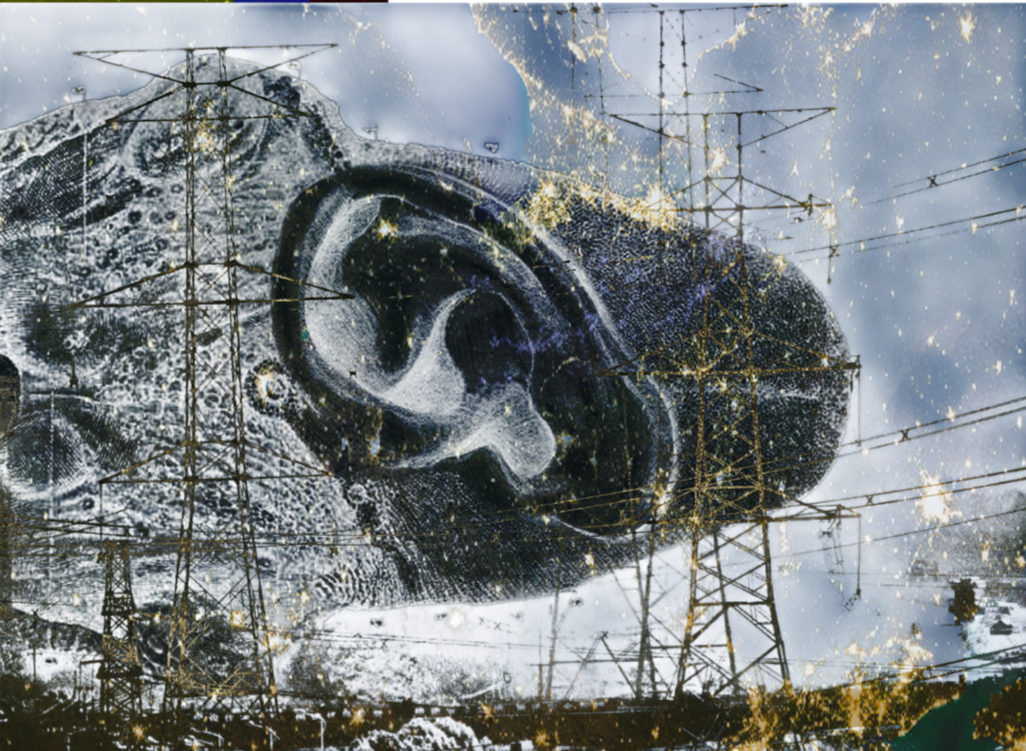
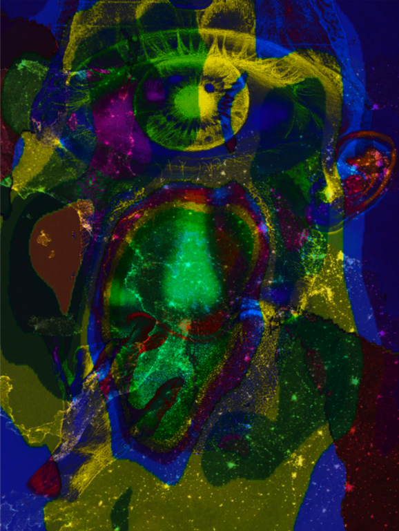
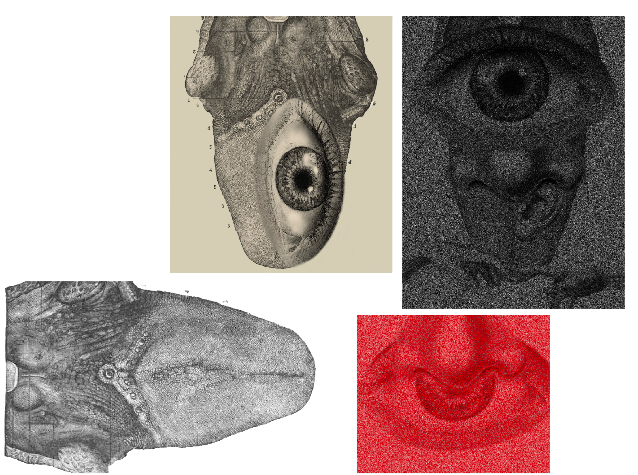
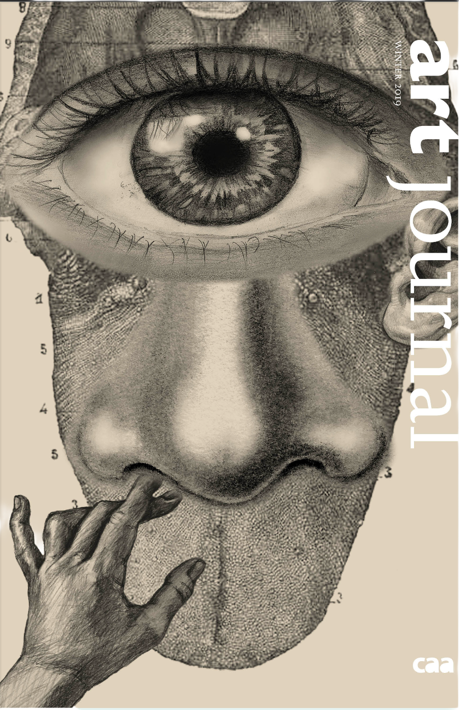
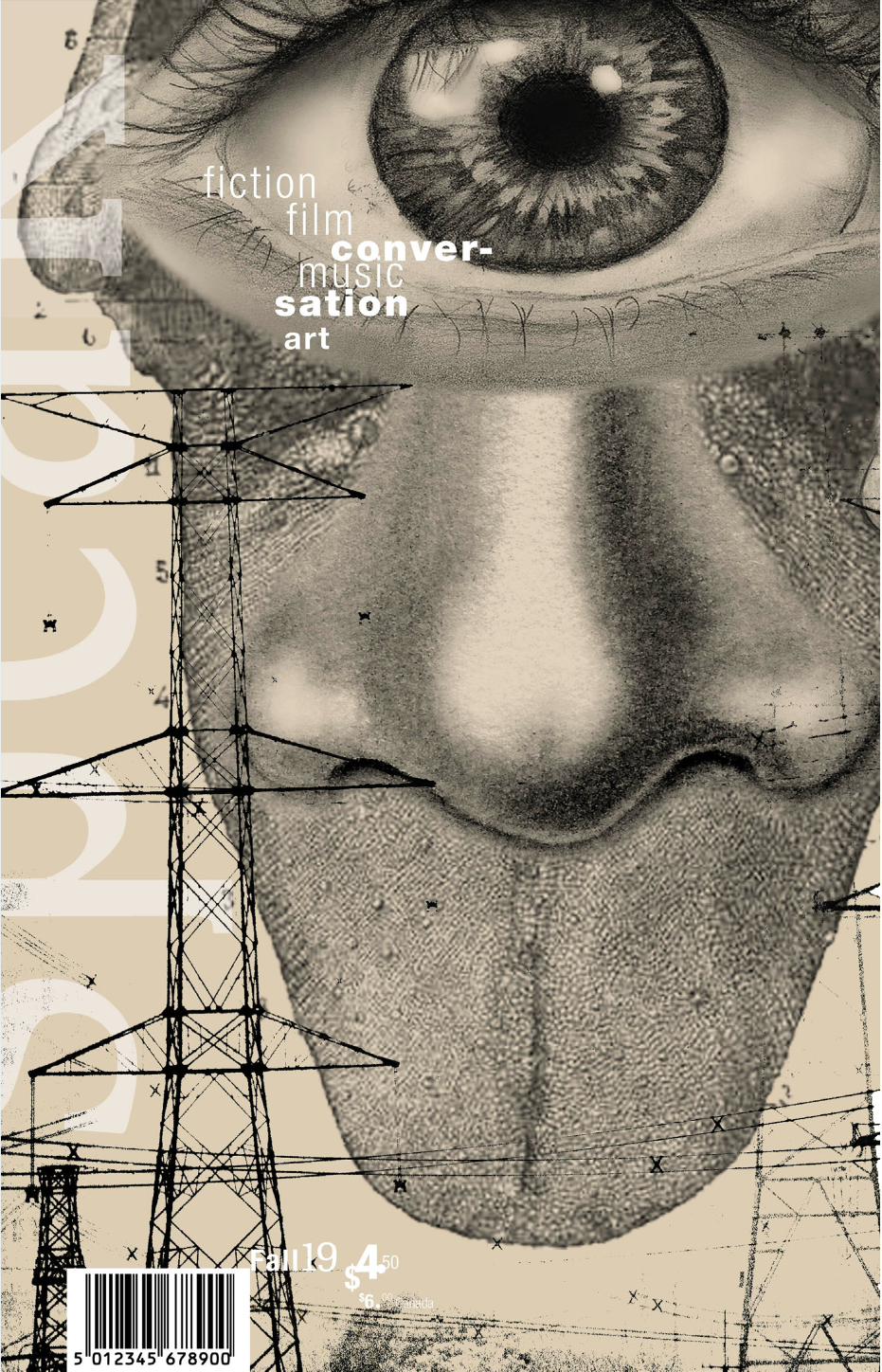
Through studying grids, I recreated two types of structured magazines. I chose Art Journal because it adheres to a grid, and I chose Speak because it does the opposite, abandoning the grid. Using the text of “Marshall McLuhan: The Medium is the Message” as an article to accompany an image narrative, I took away the idea that it’s not just about the message of the content, but about the way it is conveyed, whether digitally or analog.
This prompted me to think about the five senses humans possess and how they allow us to interact with our environment. Using this common theme of receptivity, I explored synesthesia—a phenomenon in which multiple senses operate in unison, so it is difficult to distinguish which sense is at work. In McLuhan’s essay, there is a debate about how technology may communicate information more effectively than analog, but I found that both can work simultaneously.
Unlike Art Journal, Speak is much more fluid in how it engages with a grid. I further amplified my image narrative by incorporating power lines. I chose power lines because they act as transmitters and receivers of information that flow around the world—just as humans have internally built transmitters and receivers called senses.
The Census
Print - Adobe Illustrator/InDesign
Fall 2019
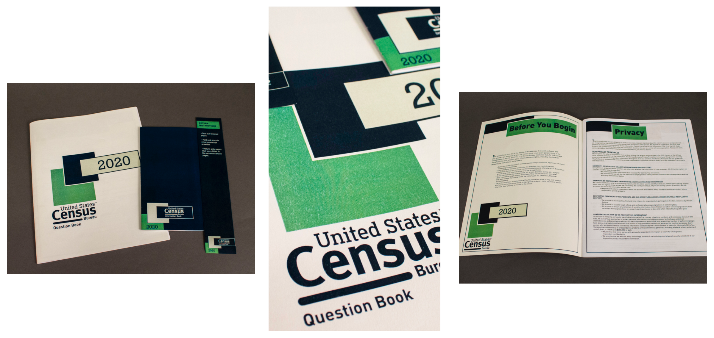
In collaboration with fellow designer Emma Petrochko, we set out to revamp the upcoming 2020 census. Our goal was to respect its formal structure so it could still be completed and tabulated efficiently, while making it feel approachable. We chose a palette of blue, green, and taupe to balance friendliness with official authority. To reduce the sense of information overload, we applied typographic strategies using DinPro and Rockwell, carefully adjusting kerning and leading to make the text concise and readable. We also separated the informational sections from the questionnaire itself, making the census easier to navigate and understand.
Informative Poster
Print - Adobe Illustrator
Fall 2020
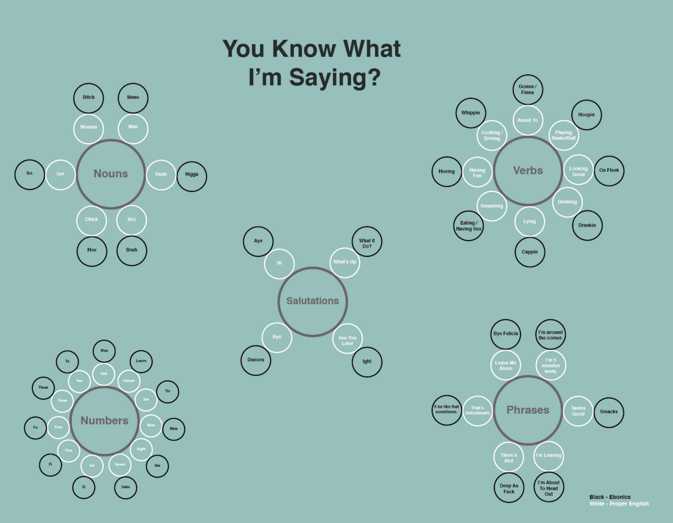
Often, we shy away from having important conversations and addressing the elephant in the room. Cultural and language barriers can make these dialogues feel impossible. But instead of letting miscommunication take over, we can use these moments to learn how to translate—so we can hold vital conversations and build a better tomorrow.
Narrative
Website - Adobe Illustrator/ Photoshop
Fall 2019
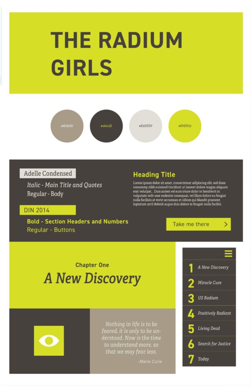
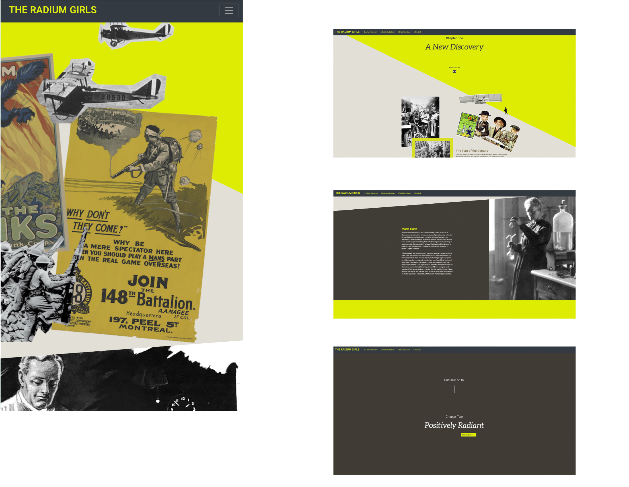
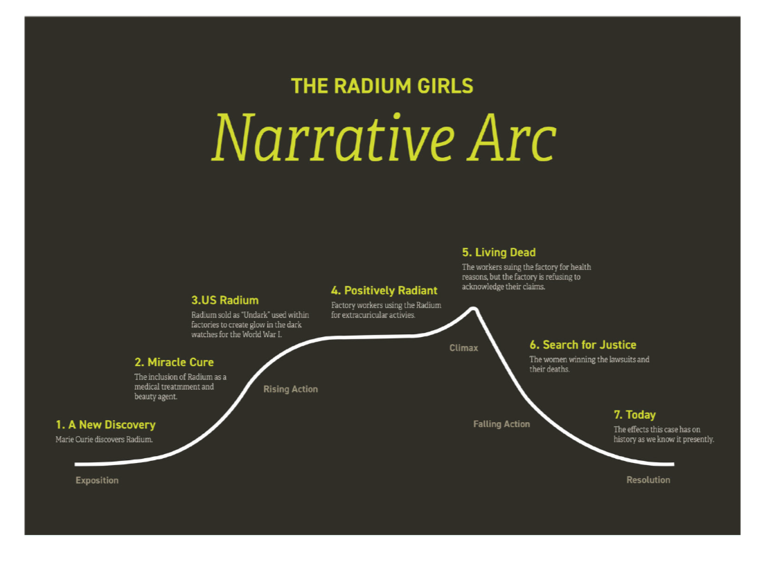
This site was created in collaboration with Brianna Litchfield and Priss Jenkins. We knew that reading history can feel tedious, so with the Radium Girls project, we aimed to make it interactive and engaging. Using shades of neon green, deep grays, and earthy taupe, we blended scientific and historical elements to bring the story to life. Through collage, we combined historical content with visual aids, giving viewers a stronger sense of the environment and context surrounding the narrative.
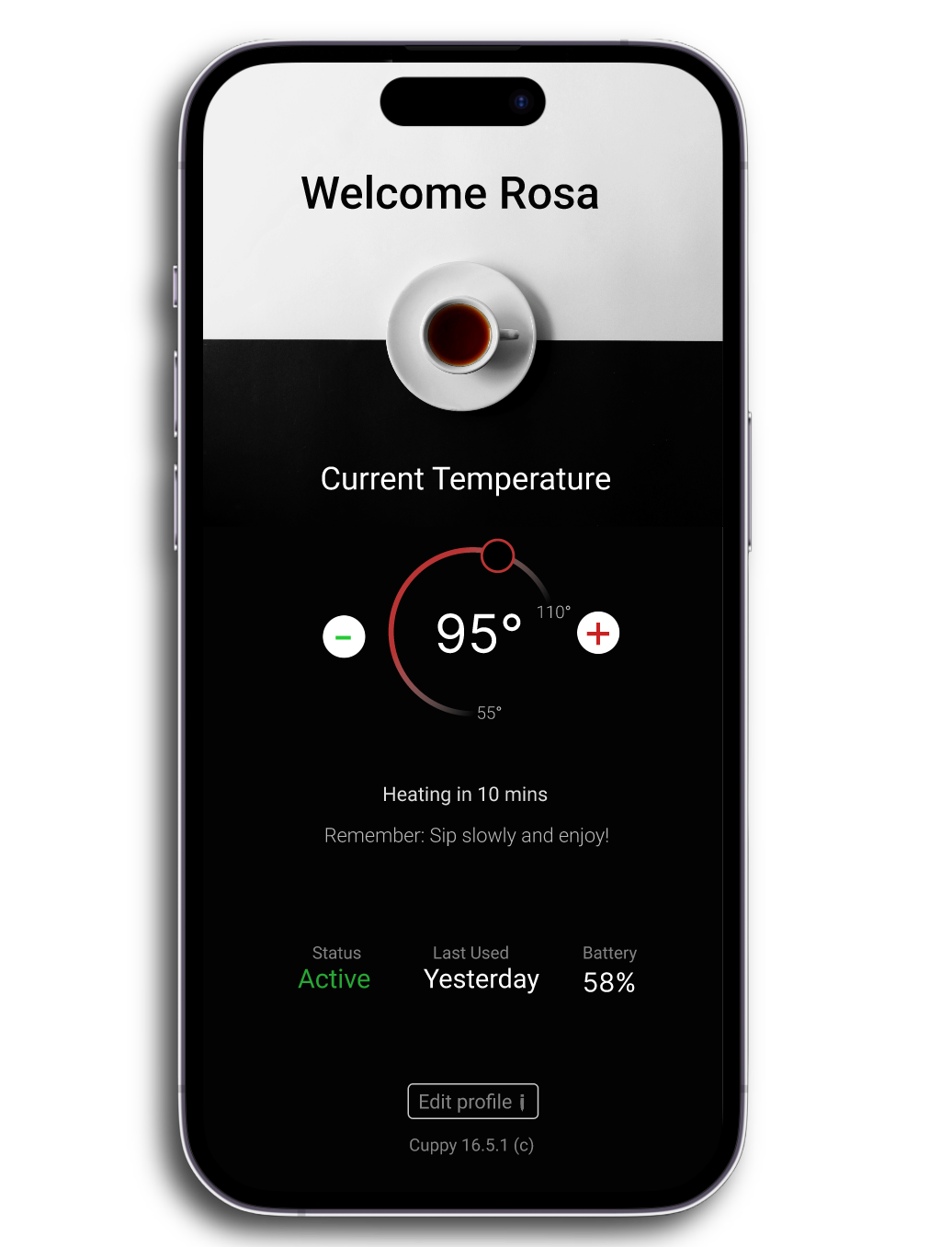
Smart Cup Settings
UI / Visual Design App - Figma
Fall 2019
This project explores the Rule of Four in interface typography through a conceptual iOS Settings screen for a smart coffee cup. The goal was to design a clear, functional interface using no more than four type sizes, relying primarily on typography rather than heavy UI components to communicate hierarchy, state, and interactivity.
The imagined scenario assumes the smart cup is already paired with the device, allowing the interface to focus entirely on configuration and status rather than onboarding.
Design Constraints
Font: SF Pro (Apple system font)
Canvas: iPhone X (375 × 812)
Type sizes used: 24pt, 17pt, 15pt, 13pt (maximum of four)
Primary UI elements: Text-driven layout with minimal use of containers or buttons
Design principle: Fewer sizes, clearer hierarchy, intentional meaning behind every typographic choice
Typographic System
The interface is structured around four recurring typographic roles:
24pt — Screen title and primary identity (Smart Cup name)
17pt — Section titles and primary actions
15pt — Body content, settings labels, and readable values
13pt — Secondary actions, metadata, and system information
Rather than introducing additional sizes, hierarchy is extended through font weight, color, alignment, and spacing, allowing multiple interface meanings to emerge from the same base sizes.
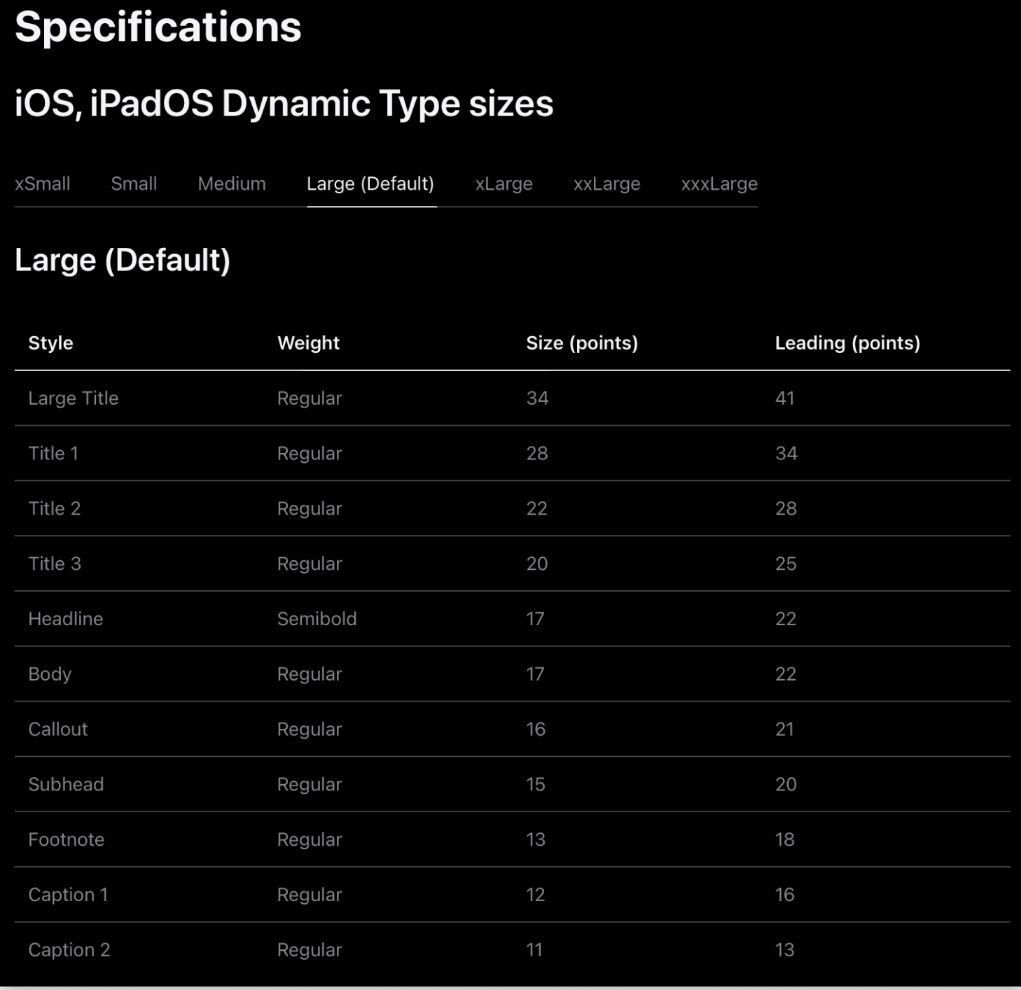
Interface Content
The settings screen includes the following attributes:
Smart Cup name
Current temperature and target temperature state
Cup LED color selection
Connection and usage status
Last used time and date
Battery percentage
Firmware version
System update action
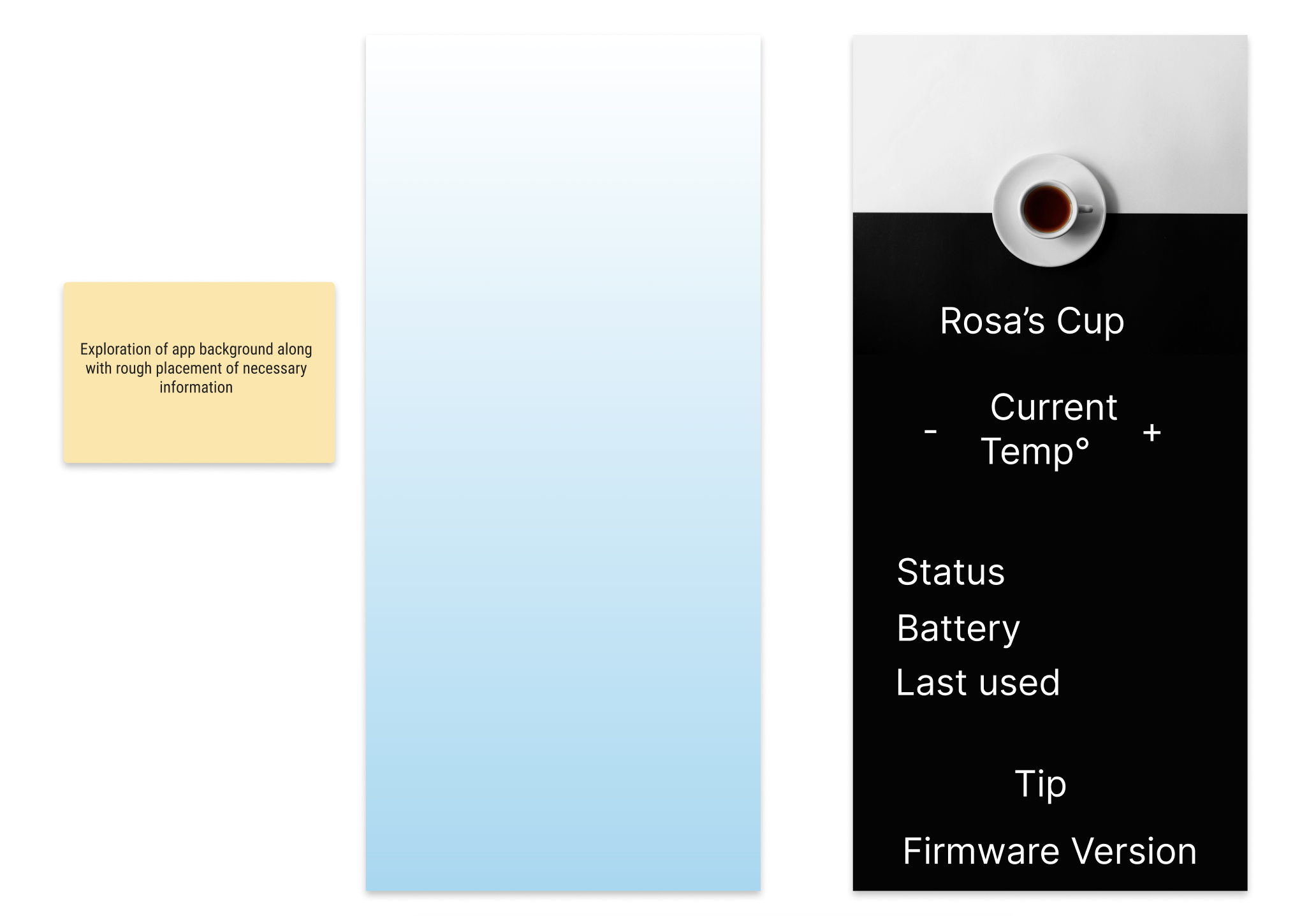
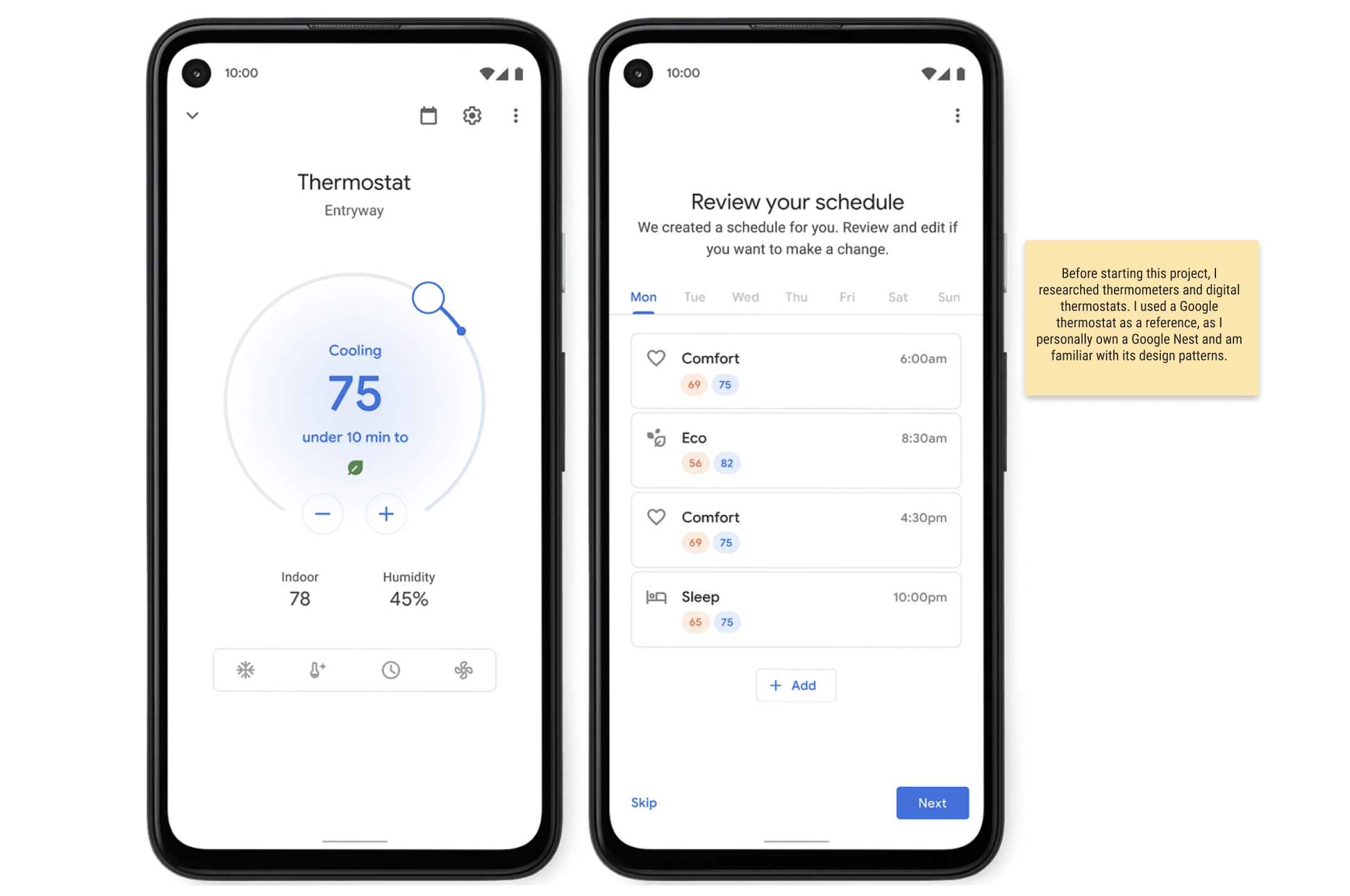
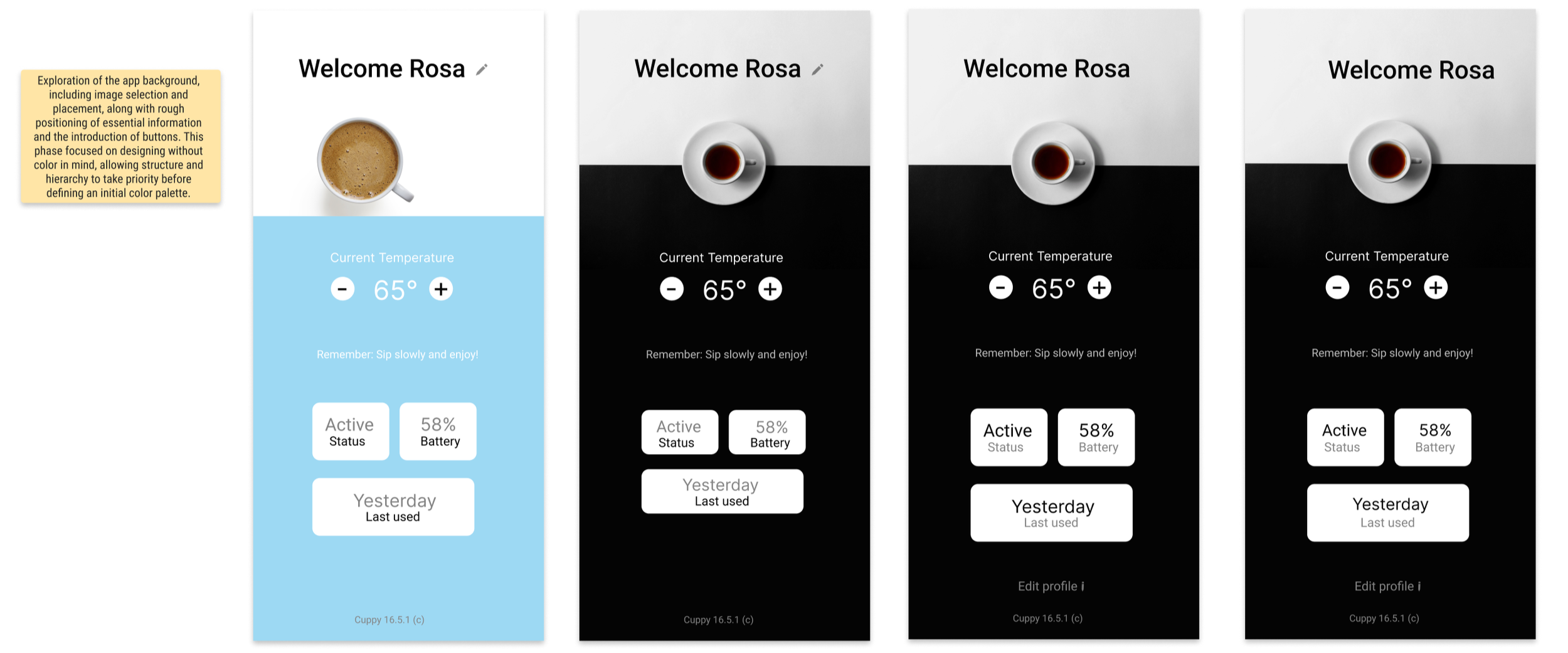
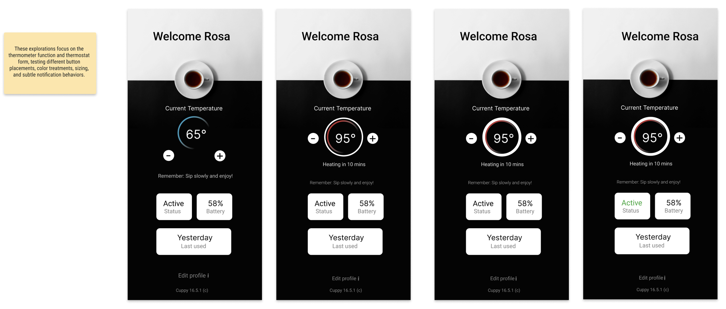
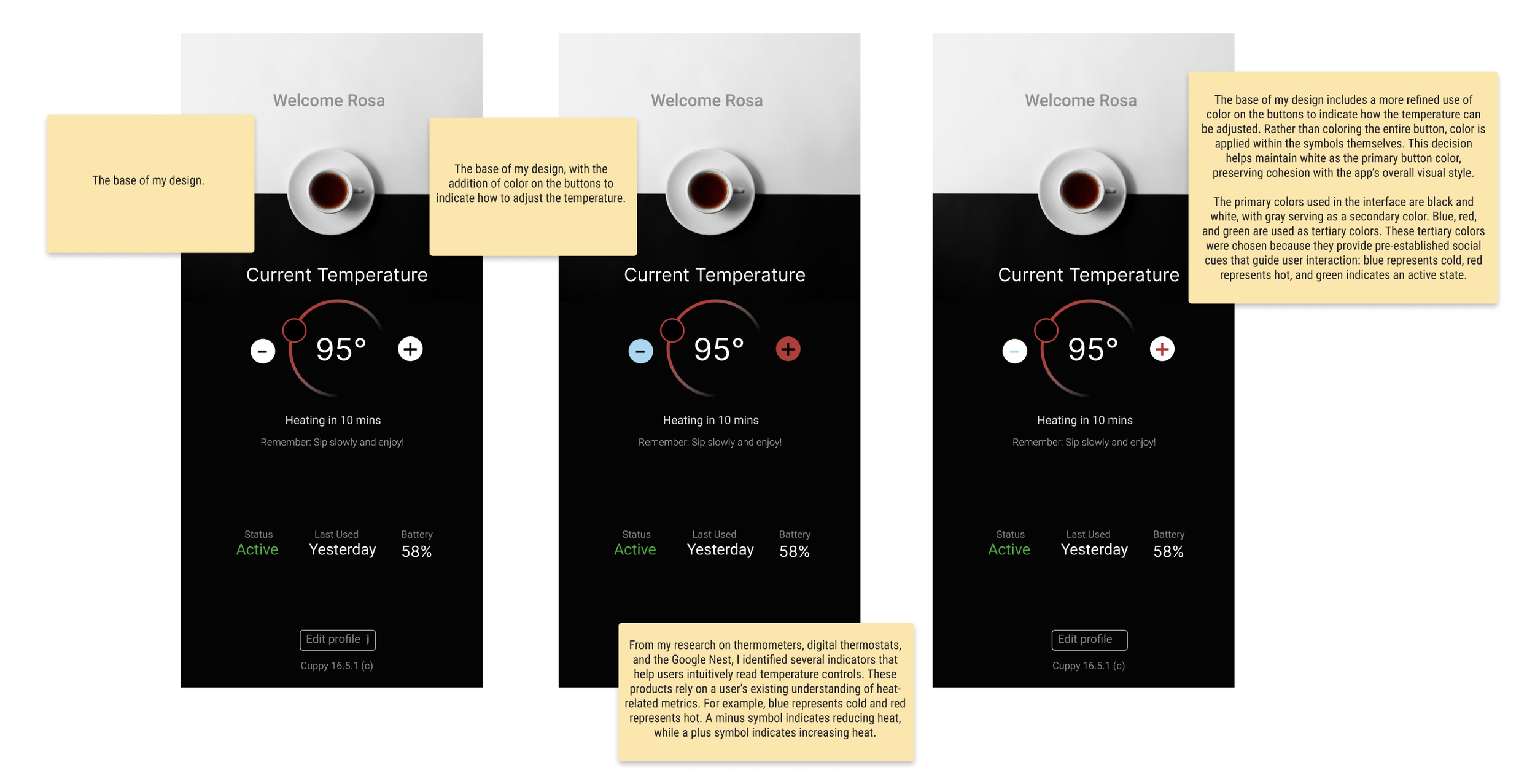
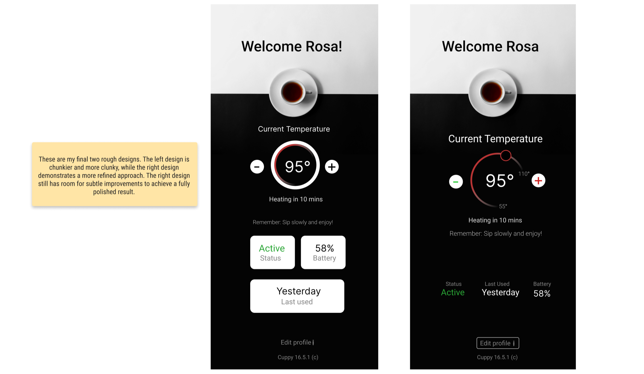
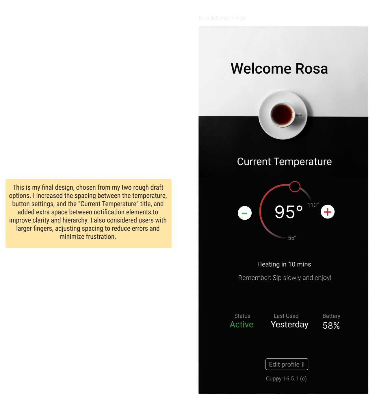
This project intentionally avoids decorative UI elements to demonstrate how typography alone can carry an interface. By constraining font sizes and relying on rhythm, spacing, and hierarchy, the design stays focused, scalable, and easy to reason about both visually and systemically.
This exercise reinforced a core principle of interface design:
The fewer font sizes you use, the stronger and more flexible your system becomes.